How to Draw Taylor Swift
In this detailed fine art tutorial, I'll teach you how to use graphite pencil, charcoal pencil, colored pencil, and pastel pencil to draw this beautiful portrait of singer and songwriter Taylor Swift.

Go ahead. Just try listening to "You Belong with Me" without singing along at the top of your lungs. It's simply not possible. Between her beautiful voice, catchy lyrics, fun melodies, and captivating performances, there's little wonder why Taylor Swift has become such a global phenomenon.
I've been wanting to draw a portrait based on this reference photo for quite some time, but it's only recently that I discovered a style that really seemed fitting. Lately, I've been experimenting with drawing on toned tan paper, and I finally developed a technique that felt perfect for this piece.
This portrait was created with a three-step process, each step concluding with a potentially complete drawing, depending on the style that you wish to produce. The first step was to develop the darker values with a graphite pencil. The second step was to add highlights with a white charcoal pencil. The third and final step was to add color with colored pencils and pastel pencils.
Throughout the project, I documented each step with sequential scans and detailed notes, which I will share with you here in this complete how-to-draw tutorial. So if you have a "Love Story" with art like I do, you may enjoy drawing this portrait yourself. Or if there is some other composition that has sparked your interest, the techniques presented here can be applied to any drawing that you may wish to create.
Skip Ahead
Looking for something specific? Select a topic in this article to read more:
Materials and Tools
Before we get started, we'll need a few basic items: graphite pencils, charcoal pencils, colored pencils, pastel pencils, paper to draw upon, and some other miscellaneous materials and tools.
Graphite Pencils
Graphite pencils are the quintessential drawing staple. They are simple but versatile tools that can be used to create fine details or shade large areas. Typically sold in multiple-piece sets, graphite pencils are available in a wide range of hardnesses. Harder pencils like 8H produce lighter values, while softer pencils like 8B produce darker values. Medium hardness pencils like HB produce midtone values.
Here is the graphite hardness that we'll use for this composition:
- 2B
Charcoal Pencils
Like graphite, charcoal pencils are carbon-based drawing tools available in multiple hardnesses. However, charcoal tends to produce darker values with a matte finish. Graphite, by comparison, tends to produce lighter values with a glossy, almost metallic finish. Charcoal pencils also tend to produce more dust and are better suited for paper with a heavier texture or "tooth."
Here is the charcoal color that we'll use for this composition:
- White
Colored Pencils
Colored pencils handle a bit like graphite pencils, but are wax-based instead of carbon-based. As the name suggests, they are available in a wide variety of colors which can be purchased individually or as complete sets. Because colored pencils produce somewhat translucent tones, it's possible to create rich effects by layering multiple colors over the same area.
Here are the pencil colors that we'll use for this composition:
- Black
- Poppy Red
- Terra Cotta
- Dark Brown
- Pumpkin Orange
- Goldenrod
- Light Cerulean Blue
- Ultramarine
Pastel Pencils
Pastel pencils are simply soft pastels in pencil form. Unlike colored pencils, they are chalk-based and comparatively soft. While colored pencils are excellent for sharp contours and fine details, pastel pencils are more appropriate for applying color to large areas. Like charcoal pencils, they work best on paper with a lot of tooth.
Here are the pastel colors that we'll use for this composition:
- Beige Red
- Light Yellow Ochre
Paper
It's easy to assume that paper is paper and doesn't warrant much consideration. But, in reality, it's available in a wide variety of sizes, colors, weights, and textures. And each of these properties makes a meaningful contribution to the look of our final drawing. For this composition, I used:
- 6 x 8in, 80lb Toned Tan Paper
But you should feel free to use paper at whichever size you prefer.
Other Materials and Tools
Finally, we'll need a few other miscellaneous materials and tools:
- Pencil Sharpener
- 1/4in Round Mechanical Eraser
- 2.3mm Round Mechanical Eraser
- Tortillon Blenders
- Cotton Swabs
For a workspace, I prefer to use a horizontal drafting table. But you should feel free to use an easel if you prefer to work vertically.
Prepare a Reference
Before we begin to lay out our composition, it is useful to have a reference image. For purely imaginative pieces, some hand sketches and color studies are usually all that is needed. For more realistic pieces, photographs are a valuable resource.
For this piece, we'll reference a photoshoot portrait of Taylor Swift found through an internet search (cropped to fit the aspect ratio of our paper):
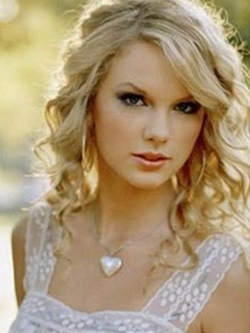
Reference
As always, our goal is not to copy the reference photo exactly, but to create art in a style that is uniquely ours. For this portrait, we'll omit the background to place focus on the subject. We'll sharpen some of the details in the face. And we'll make adjustments to the overall tone and value that allow us to work with the color of the toned paper and the richness of the colored pencils and pastel pencils.
Create the Sketch
A great drawing begins with a thoughtful sketch. Although they will ultimately be erased by the time the piece is complete, the first few pencil strokes are arguably the most important. They establish the basic proportions, layout, and contours that ensure the rest of our drawing is on the right track. By loosely establishing these guiding features from the start, we save ourselves much rework and frustration later on.
Here is the graphite hardness that we'll use for the sketch:
- 2B
Establish the Basic Contours
We start by sketching a few simple contours to define the most important features of the portrait: the face, hair, neck, shoulders, and clothes. At this stage we're not concerned with detail, but with accurate size and location in space.
Portraits tend to be rather unforgiving of inaccuracies. Even small discrepancies in the size, shape, or placement of facial features may be visually jarring in the final piece. The exacting nature of portraits makes them both challenging and satisfying to complete. While purists may insist on sketching each feature entirely freehand, multiple techniques are available to assist us in this process should we choose to utilize them.
One popular technique is to apply matching grids to the reference photo and drawing paper. The horizontal and vertical lines create useful references for locating features within the composition. I utilize this technique often for acrylic paintings because the grid lines will ultimately disappear beneath the first layers of paint. For drawings, however, the grid lines will have to be erased when they are no longer needed. Because of that, I tend to avoid this technique here.
My preferred technique is to print out the reference image at the same size as the drawing. I place the reference photo immediately beside the blank drawing paper and sketch the contours freehand. This makes it much easier to match the proportions.
Once the contours are sketched, I place the reference photo on top of the drawing. Using a finger to pin the top left corner, I flip the reference photo back and forth a few times, allowing my eyes to quickly compare the features in the photo to the features in my sketch. If anything appears out of place, I set the reference photo aside and adjust the sketch as needed. You may repeat this process as many times as required until you are satisfied with the sketch. As you become more experienced with drawing, you'll likely find that the adjustments become fewer and finer.
This technique satisfies the purist in me because I'm still drawing the contours freehand. But it also satisfies the perfectionist in me by providing a useful sanity check that my work is indeed accurate.
Here is the sketch with basic contours established:
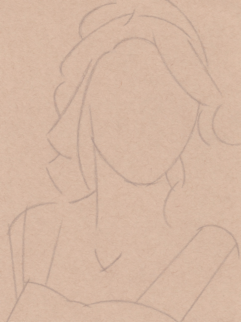
Basic Contours Sketched
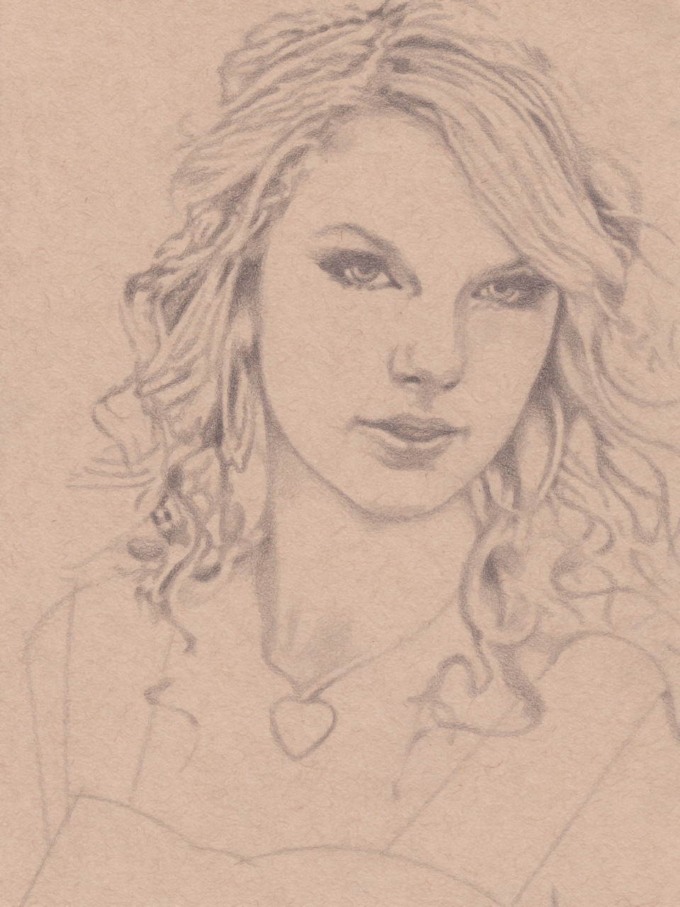
Add Details
With the basic contours established, we're ready to add some additional details to our sketch. Most important are the eyes, nose, and mouth.
Here we use the same technique as in the previous step. Once again, we want to keep our sketch lines loose and simple. Our goal is not to capture every little inflection in the contours, but to create reference lines that accurately size and locate features in space.
Here is the sketch with details added:

Sketch Details Added
Develop the Drawing with Graphite Pencil
With the sketch complete, we're ready to begin developing individual areas of the drawing by adding finer details and shading.
For this step, we'll use the same graphite hardness that we used to create the sketch:
- 2B
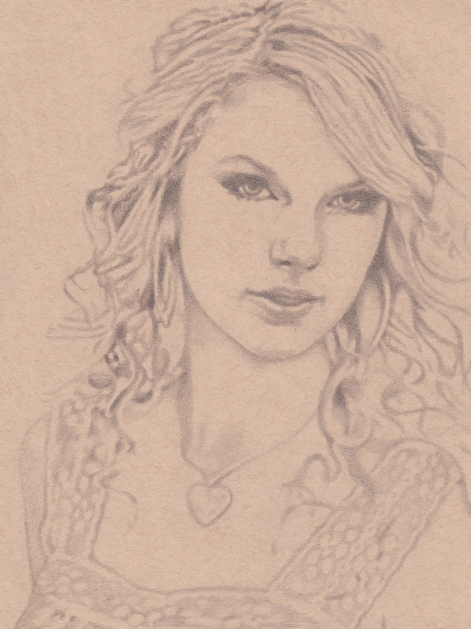
Develop the Face
We'll start by developing the most essential part of the portrait: the face. Paying close attention to the reference photo, we give form to the eyes, nose, mouth, and hairline, faithfully replicating each on our drawing paper. At this stage, we're no longer working strictly with lines but with shapes. Harder and softer edges allow us to distinguish discrete details like the irises and pupils from more subtle features like the curvature of the face. And variations in the pressure we apply to the pencil allow us to indicate shadows through shading.
There's no need to add much, if any, shading to the forehead or cheeks. These areas will range from midtone to highlight values in the final piece, so we'll develop them in later steps.
As we develop the face, the sketch lines that we created in the previous step will no longer be needed. We can erase them easily and accurately without disturbing the developed areas of our drawing by using a 2.3mm round mechanical eraser.
Here is the drawing with the face developed:

Face Developed
Develop the Hair
Next, we develop the hair. Fortunately, hair is far more forgiving than facial features. While a misshapen eye will immediately earn scrutiny from the viewer, errant strands of hair will likely go entirely unnoticed.
Still our approach to this area is neither sloppy nor haphazard. We want to continue to pay close attention to form. While individual strands of hair may be little more than lines on the page, together they produce volumetric shapes that catch highlights and cast shadows just like any solid object. Some areas will present as large cohesive forms while others will present as sheets or thin strands. Some areas will overlap other areas. We also want to capture the subtle variations and direction changes in the flow of the hair.
This is also a good opportunity to add a little shading to the neck and necklace.
Here is the drawing with the hair developed:
Hair Developed
Develop the Clothes
Finally, we develop the clothes. The pattern in the fabric is rather intricate. And while we want to capture these details in our drawing, we do not want the complexity to draw attention away from the face. So we'll keep the edges soft and the contrast low.
Here is the drawing with the clothes developed:
Clothes Developed
Blend the Drawing
At this point our graphite drawing is nearly finished. There's one last task to complete this step of the process: blending.
Blending accomplishes a few things. It softens the pencil marks used to shade larger areas, creating much smoother gradients. It lifts loose graphite dust from the paper, which helps to reduce smudging later on. It also burnishes firm graphite marks into the paper, creating a more stable drawing with somewhat darker values that are less likely to lighten as we continue to work the portrait in future steps.
There are two primary tools that I recommend for blending graphite. For large areas, I prefer a cotton swab (that's right, the kind you use to clean your ears). For fine details, I prefer a paper tortillon.
With the cotton swab, we start with light pressure, blending large areas in a series of small circular motions. We can increase pressure where desired to further smooth and darken the graphite. With the tortillon, we work in pencil-like strokes, matching our motions to the contours of the fine details that we are working.
When finished, we clean up any large smudges using a 1/4in round mechanical eraser.
Here is the drawing with the graphite blended:

Drawing Blended
At this point we have a complete graphite drawing. And if you're satisfied with the monochromatic style, you are free to stop here and sign your work. But if you'd like to make your portrait even more interesting, let's continue on to add highlights with charcoal pencil.
Add Highlights with Charcoal Pencil
With the graphite drawing complete, we are now ready to utilize one of the unique benefits of using toned paper: the ability to add highlights. Plain white paper only allows us to add value in only one direction: darker. But toned paper allows us to start with a midtone value that we can adjust in two directions: darker and lighter.
Here is the charcoal color that we'll use for this step:
- White
Charcoal pencils behave a lot like graphite pencils. However, they tend to be a bit softer which produces more dust and makes them more susceptible to smudging. We can minimize smudging by being careful not to rest our hand on portions of the drawing where we've already placed highlights. For right-handed artists, it's helpful to work from left-to-right across your drawing. For southpaws, working right-to-left is recommended. But don't fret if you do manage to incur a few smudges along the way. These are easily removed with our round mechanical erasers.
Because charcoal pencils are relatively soft, they also tend to dull faster than graphite pencils. Believe it or not, this can actually be a useful property of the medium. The trick is to render the finer details first while the pencil is still sharp. The corneas, the highlights on the eyes and lips, and the details within the necklace should be the first receive our attention. As the pencil dulls slightly, we focus on the highlighted strands of hair and patterns within the clothes. As the pencil dulls more substantially, we finish up with the soft highlights upon the face, neck, and chest. Of course, we are free to sharpen our charcoal pencil at any time throughout this process. But the general strategy of working from finer to softer highlights allows us to work with the medium rather than against it.
Once we've applied all of the highlights, we lightly blend the white charcoal with a cotton swap, thus smoothing the pencil marks and reducing the potential for future smudging.
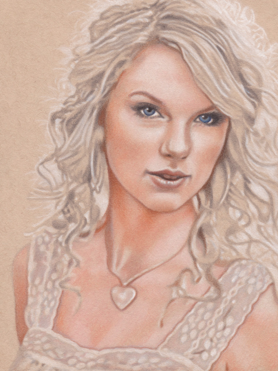
Here is the drawing with highlights added:

Highlights Added
At this point we have a complete graphite drawing with white charcoal highlights. And if you're satisfied with the duochromatic style, you are free to stop here and sign your work. But if you'd like to make your portrait even more interesting still, let's continue on to add color with colored pencils and pastel pencils.
Add Color with Colored Pencils and Pastel Pencils
Before we continue, let's take a moment to appreciate how far we've come with nothing more than a 2B graphite pencil and a white charcoal pencil. By now our drawing is looking really good. But there's still one more dimension that we can add to bring this portrait to life: color.
To accomplish this, we'll use a combination of pastel pencils and colored pencils: pastel pencils to apply a base tone; and colored pencils to add definition. Okay, I know what you're probably thinking:
"You mean I just spent all that time developing a beautiful graphite and charcoal drawing and now you want me to cover the entire thing with colored media? Won't that obliterate all of my hard work?"
An understandable concern, for sure. But one that illustrates the beauty of pastel pencils and colored pencils. Because both mediums produce translucent layers, the shadows and highlights that we previously established will continue to clearly show through. And because we took the time to burnish the graphite and charcoal into the paper, the existing media will resist smudging.
Apply the Base Skin Tone
Let's start by applying the base skin tone to the face, neck, and chest.
Here is the pastel color that we'll use for this step:
- Beige Red
We want good coverage with this layer, so don't be afraid to apply some pressure to the pastel pencil. The graphite and charcoal layers that we previously developed will not be disturbed.
The pastel pencil may pick up a little value from the underlying layers, so it's best to work from light to dark. We start with the midtone values surrounding the white charcoal highlights, working in small circular motions to maintain smooth transitions between these areas. Where highlights are the strongest, there's no need to apply color on top of the charcoal. We want to keep these areas white. Where highlights are bit more muted, we can add some pastel to soften the contrast.
Once color has been applied to the highlighted areas, we move on to the midtone areas where we have applied neither graphite nor white charcoal. This process is quite straightforward since we're applying media to virgin paper.
Then, we progress to the transitions between midtones and shadows, and finally to the shadows themselves, again working in small circular motions to maintain smooth gradients.
You've likely noticed that this process has left a fair amount of pastel dust on the regions where we applied color. To prevent future smudging, we once again turn to our trusty cotton swap. We brush lightly across the colored areas to firm up any pigment that has been embedded in the tooth of the paper and to remove any loose dust that cannot take hold. A gentle touch is all that is required. Too much pressure and we'll end up removing pigment from the drawing.
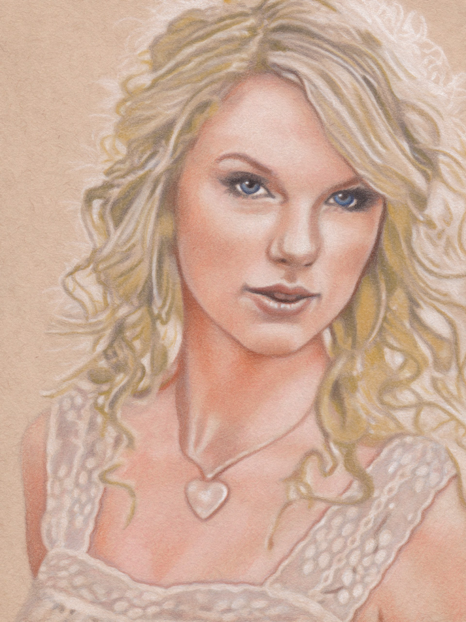
Here is the drawing with the base skin tone applied:
Base Skin Tone Applied
Render the Face
With the base skin tone applied using pastel pencil, we're ready to add definition to the face, neck, and chest using colored pencils.
Here are the pencil colors that we'll use for this step:
- Black
- Poppy Red
- Terra Cotta
- Dark Brown
- Pumpkin Orange
- Light Cerulean Blue
- Ultramarine
Let's start with the gateways to the soul: the eyes. First, we add contrast and definition to the eyelashes using Black colored pencil. Then, we darken the pupils, taking care to preserve the white reflections that we've already created with white charcoal. With the darkest values established, we can now add some hue to those baby blue irises using Light Cerulean Blue and Ultramarine.
For the lips, we apply Poppy Red and Terra Cotta, continuing to remain mindful of the existing highlights.
We work the rest of the skin tones using Pumpkin Orange and Dark Brown. This is typically an iterative process: darken the midtones with Pumpkin Orange, further darken the shadows with Dark Brown, compare to the reference photo, then repeat as necessary. Take your time. At this stage, it's easier to add more value than it is take value away. So don't be afraid to approach this process with a light touch and sneak up on the final values gradually.
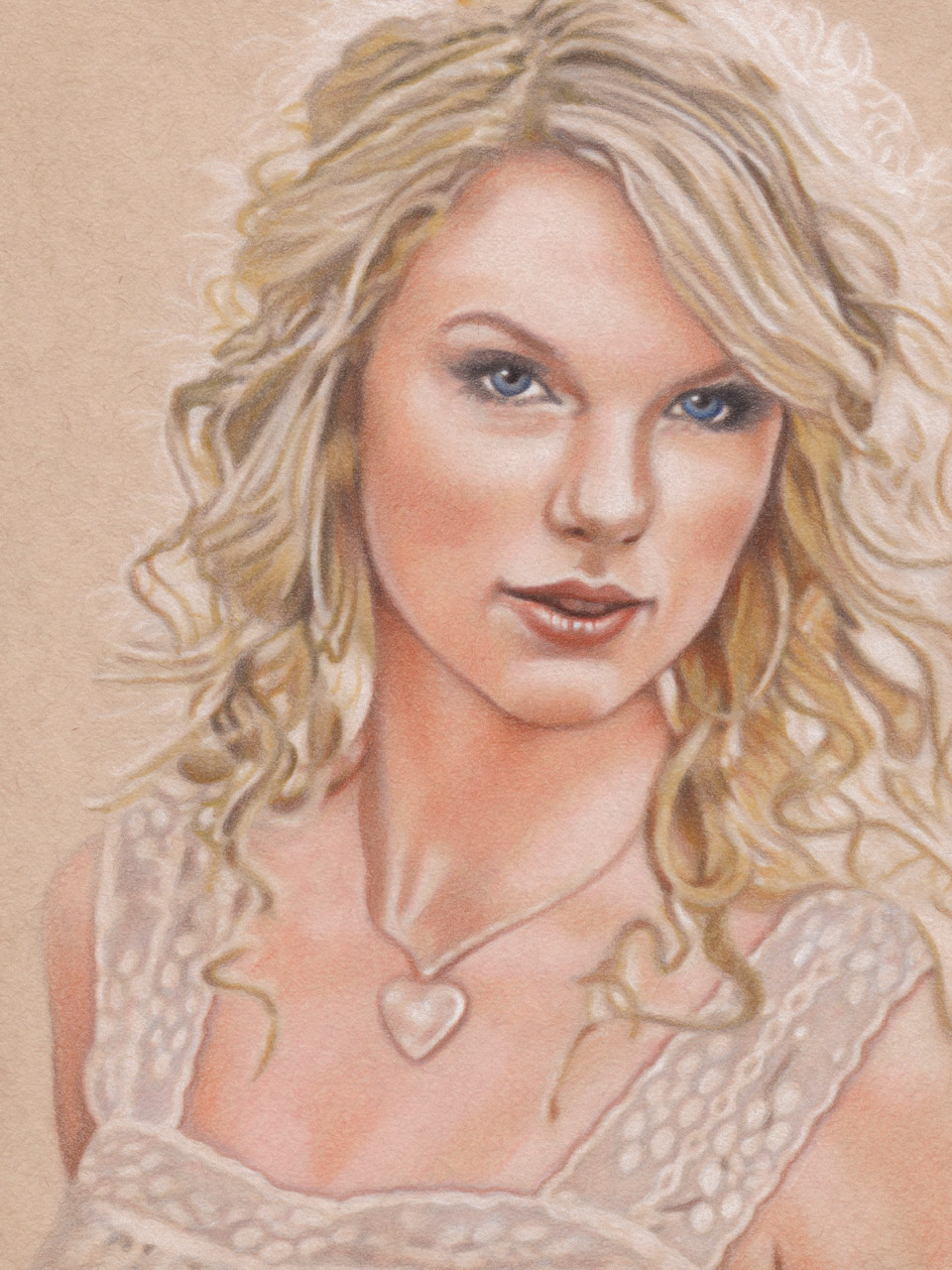
Here is the drawing with the face rendered:
Face Rendered
Apply the Base Hair Tone
With the face rendered, we can apply the same process to the hair, starting with a base tone of pastel pencil.
Here is the pastel color that we'll use for this step:
- Light Yellow Ochre
As before, we work from light to dark. But instead of using small circular motions, we now use pencil strokes that follow the flow lines of the hair. When we are finished, we stabilize the media with some light strokes of our cotton swab.
Here is the drawing with the base hair tone applied:
Base Hair Tone Applied
Render the Hair
With the base hair tone applied, all that's needed is a little more definition to call those golden locks complete.
Here are the pencil colors that we'll use for this step:
- Black
- Terra Cotta
- Dark Brown
First, we add a touch of warmth to some of the midtones with Terra Cotta. Then, we darken the areas of deepest contrast with Dark Brown and a touch of Black.
Here is the drawing with the hair rendered:
Hair Rendered
Finishing Touches
At this stage, our drawing is nearly complete. But to my eye, some of the hues in the face still appear a bit muted.
Let's use two more colored pencils to finalize our drawing:
- Poppy Red
- Goldenrod
First, we add a bit more vibrance to the lips by adding one final layer of Poppy Red.
Then, we add some warmth to the skin by applying a light layer of Goldenrod to the midtones and a subtle touch of Poppy Red to the cheeks.
And with that...
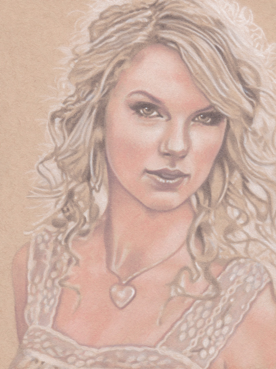
Congratulations! Your drawing is now finished and ready to sign:

Finished Drawing
And there you have it! A beautiful portrait of singer and songwriter Taylor Swift that you can hang in your home.